Eastern State Penitentiary in Philadelphia in Philadelphia County, Pennsylvania — The American Northeast (Mid-Atlantic)
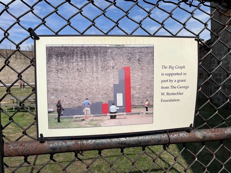
The Big Graph
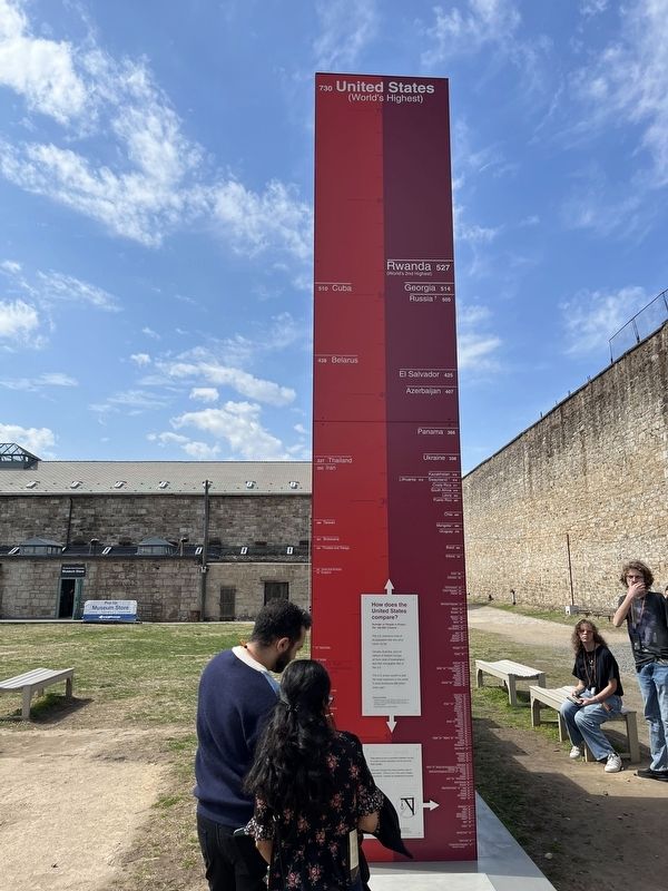
How does the United States compare?
Number of People in Prison Per 100,000 Citizens
The U.S. imprisons more of its population than any other nation, by far.
Canada, Australia, and the nations of Western Europe all have rates of incarceration less than one quarter that of the U.S.
The U.S. prison system is also the most expensive in the world. It costs $80 billion every year.
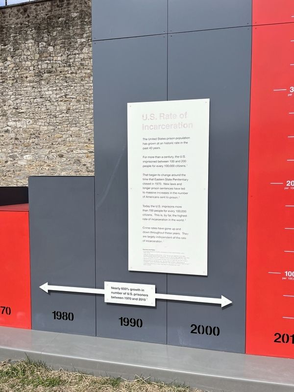
U.S. Rate of Incarceration
The United States prison population has grown at an historic rate in the past 40 years.
For more than a century, the U.S. imprisoned between 100 and 200 people for every 100,000 citizens.
That began to change around the time that Eastern State Penitentiary closed in 1970. new laws and longer prison sentences have led to massive increases in the number of Americans sent to prison.
Today the U.S. imprisons more than 700 people for every 100,000 citizens. This is, by far, the highest rate of incarceration in the world.
Crime rates have gone up and down throughout the years. They are largely independent of the rate of incarceration.
Nearly 600% growth in number of U.S. prisoners between 1970 and 2010.
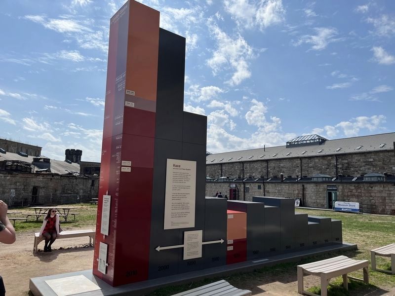
Race
and the U.S. Prison System
Although
this page online
In 1970, more than half of U.S. prisoners were White. That percentage shrank to just 36% by 2010.
In that time, Black and Latino prisoners grew to 60% of the U.S. prison population (while just 30% of the general population).
Why is this happening? Many scholars point to the strong correlation in the U.S. between race, poverty, and lack of opportunities such as quality education.
What other factors might be contributing to this trend? How do you think our nation should address this crisis?
Latino prisoners made up just 5% of the prison population in 1970. That percentage grew to 21% by 2010, when the general population was 16% Latino.
Black Americans were already greatly overrepresented in prisons and jails in 1970. This group remained about 40% of the prison population in 2010, but only 13% of the general population.
With shrinking percentages of White prisoners, Black prisoners are now the largest racial group
Erected by Eastern State Penitentiary Historic Site.
Topics. This historical marker is listed in these topic lists: African Americans • Anthropology & Archaeology • Hispanic Americans • Law Enforcement. A significant historical year for this entry is 1970.
Location. 39° 58.147′ N, 75° 10.328′ W. Marker is in Philadelphia, Pennsylvania, in Philadelphia County. It is in Eastern State Penitentiary. It can be reached from Fairmount Avenue west of Corinthian Avenue, on the right when traveling west. Touch for map. Marker is at or near this postal address: 2027 Fairmount Ave, Philadelphia PA 19130, United States of America. Touch for directions.

Regionally, this marker is in Southeast Pennsylvania. It is also in the American Northeast and in the Mid-Atlantic. Globally, it is in North America, the Western Hemisphere, the Western World, and the Anglosphere. Historically, it finds itself in what was once the Haudenosaunee (Iroquois) Confederacy, New Netherland, and one of the original Thirteen Colonies.
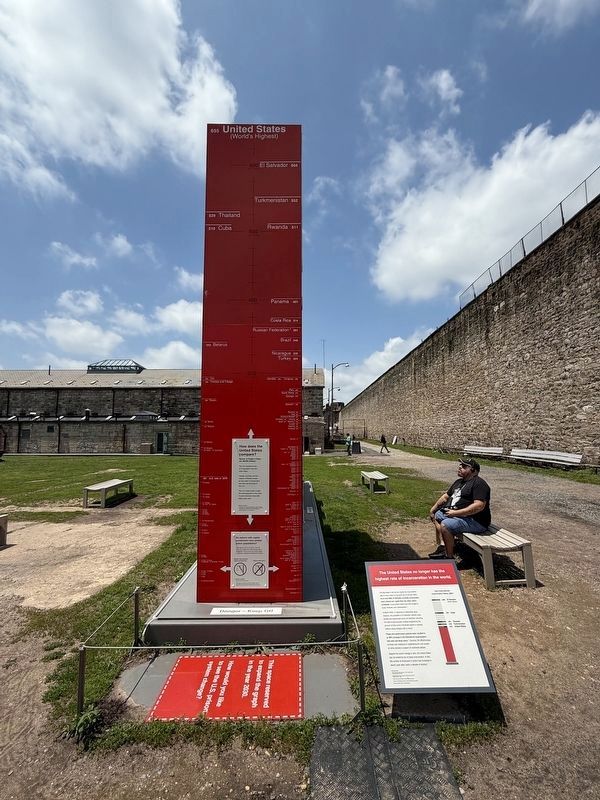
Other nearby markers. At least 8 other markers are within walking distance of this marker: The United States no longer has the highest rate of incarceration in the world.
Another marker is no longer nearby. 2020 Rate of Incarceration (was here, next to this marker but has been replaced with another marker now near it).
Credits. This page was last revised on June 1, 2025. It was originally submitted on March 26, 2022, by Devry Becker Jones of Washington, District of Columbia. This page has been viewed 390 times since then and 41 times this year. Photos: 1, 2, 3. submitted on March 26, 2022, by Devry Becker Jones of Washington, District of Columbia. 4. submitted on June 1, 2025, by Devry Becker Jones of Washington, District of Columbia. 5. submitted on March 26, 2022, by Devry Becker Jones of Washington, District of Columbia.